Brandless Health & Wellness
Art Direction / Marketing / Design / Social
Brandless wanted to expand their health and wellness selection, focused on bringing in newer and more relevant items to compete with the current market trends. Based on research conducted by the Merchant team, there was a direct connection between our target audience of the millennial generation and health and wellness industry. There was a higher interest in natural and organic ingredients, and over 61% of users interviewed use vitamins or dietary supplements. The two main hurdles that Brandless wanted to tackle was helping curate a highly saturated industry, and to make pricing more accessible for everyone.
The Ask
In preparation for the launch of these new products, various marketing materials were needed for influencers, the press, and customers. These assets included a lookbook to showcase the assortment, ingredients and benefits to our influencer partners, a social campaign and launch email to educate customers on the new products, as well as site assets such as the homepage banner.
Color Exploration
Taking inspiration from the colors of the packaging for the new wellness products, I wanted to use one color to unify the campaign, which is something that worked well for campaigns in the past. I took what was given as some of the projected bestsellers and tested them on collateral we knew we needed to design for, a page in a lookbook for example. I landed with the green from the Matcha Green Tea Powder packaging, not only was it one of the hero products of the launch, the green felt very in line with the health and wellness message we were communicating.
Product packaging inspiration
Color options based on some of the projected bestsellers
Lookbook
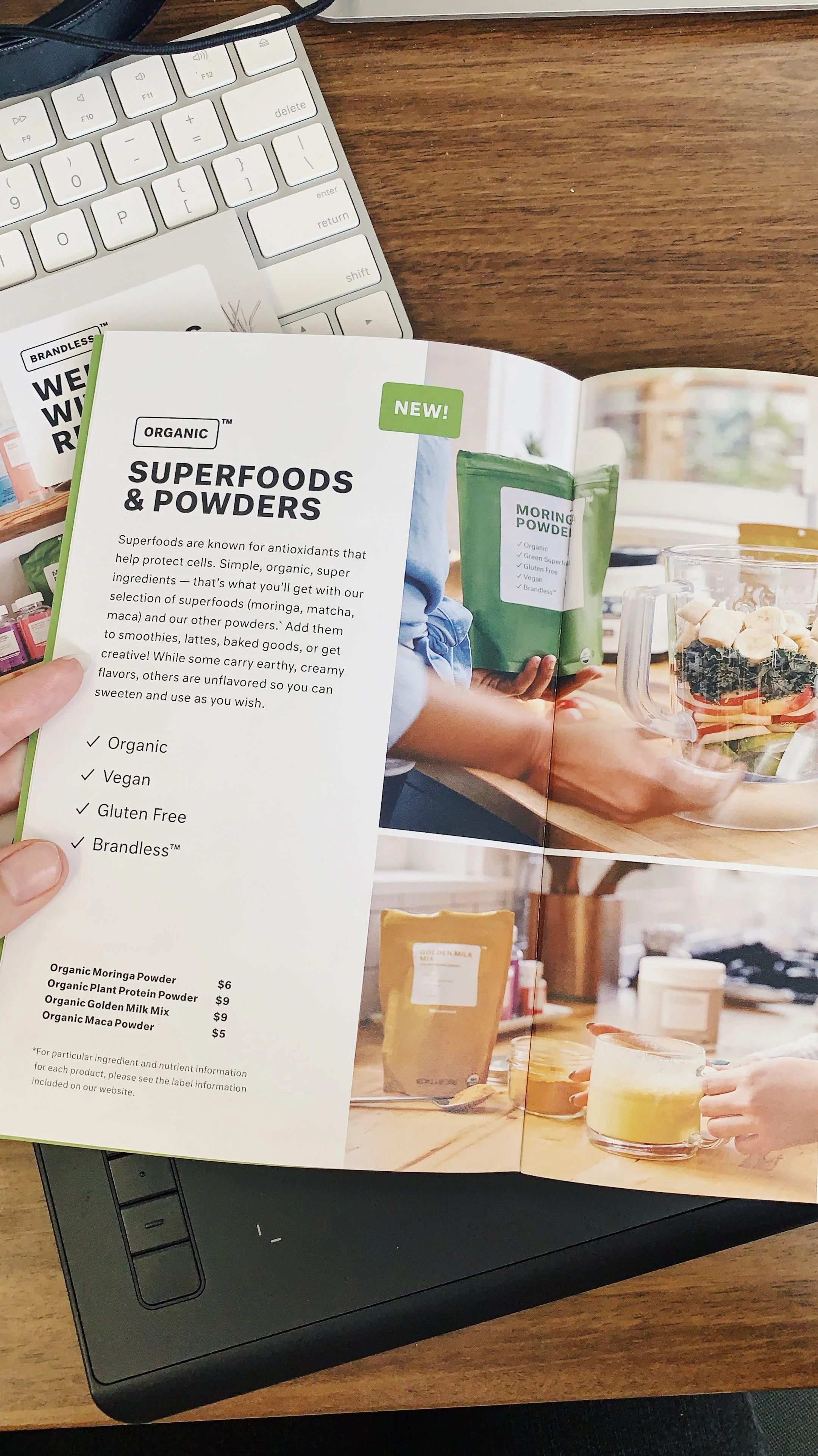
The lookbook for the Health & Wellness launch was created for our influencer partners to highlight the new assortment. It highlights the quality ingredients of the products, as well as the benefits customers can expect to receive. While the health & wellness category in the market is currently booming, we had to find a way to set ourselves apart with both quality and value. I had created a template for lookbooks in previous launches, and used that as a starting point in not only designing for this campaign, but to help inform content. The content written for the lookbook was used as the “source of truth” for the campaign, so that other teams, such as marketing and product, could pull directly from the approved lookbook copy without having to rewrite anything or go through additional approvals. This streamlined the process tremendously.
Initial layout and color explorations for the lookbook. The template was referenced from previous launch campaign lookbooks that I helped create a structure for, primarily to inform content and photography.
Social & Email
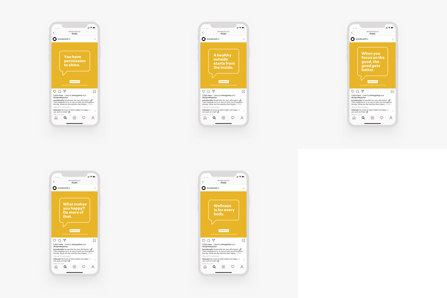
Since community is a such a big part of Brandless, we wanted to share the excitement around the Health & Wellness launch with them on social media with stories and posts. This included a launch story on Instagram, highlighting content pulled from our lookbook, as well as a more motivational series focused around self care. This series was made as both a Facebook and Instagram post, a GIF flipping through the motivational quotes, as well as a story of static images. It was intended to be something that was easily sharable by our community and highly engaging.
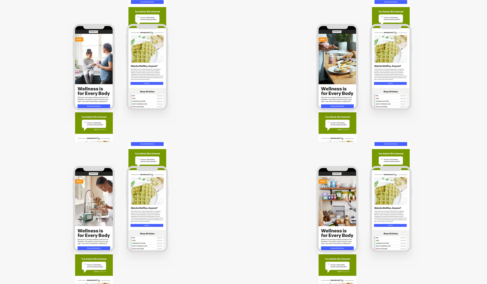
We also created a general email that was sent out to share the launch. This email drove $30k in sales on launch day.
Campaign launch story based on design & content of the lookbook
Exploration for usage of color, typography, and graphic elements.
Final Instagram post to promote daily aspirations
Email design process, primarily focused on content hierarchy
Site
This campaign perfectly aligned with the visual updates I was helping the Product team make to the site, and the homepage banner was one of the first priorities since it’s the first thing users engage with on Brandless’ site. User testing had showed us that the current homepage carousel had no conversion effect compared to a static image, so I made the decision to go with a static image template that could be changed out weekly or bi-weekly based on marketing needs. The template, which included 3 images total, had a hero image, a textural image to break up the photography and add a design element that aligned with Brandless’ better-for-you ingredients, and a UGC photo.
Creative direction: Deena Keller
Art direction: Kelly Zerbe
Photography direction: Natasha Claro, Fidel Lirio
Brandless In-House


